top of page
Vaishnavi Shelke
.png)

Project Overview
The Product : Flower Catalogue App named “Blossom” is a online flower ordering app. This could help users to order flowers from florist near them & user can select florit as per their choice and convenience.
Project Duration : August 2021 to December 2021.
The Problem : People who need flowers daily have to go out to buy it on daily basis and people who order flowers online do not always get delivery on time.
The Goal : To help users to select florist near them as per their choice and order flowers as per their need.
My Role & Responsibilities : Conducting interviews, paper and digital wireframing, low and high-fidelity prototyping, conducting usability studied, accounting for accessibility and iterating on designs
User Research
User Research : Summary
I conducted interviews and created empathy maps to understand the users I am designing for and their needs. A group of users identified during research was order flowers and do not receive their order on time, Blossom app will help users to order flowers by checking how much time it’ll take to deliver.
It is also observed that some people order flowers oftenly for god, festivals and occasions. Sometime user order flowers from any location far away from them & don’t receive order on time. Some users don’t have time to buy flowers by going to market & some users not able to go outside daily to buy flowers.
User Research : Pain Points
1
Time
Working adults are to busy to buy flowers by going to market daily.
2
Accessibility
Platforms for ordering flowers don’t have an option to order flowers from florist of users choice.
3
IA
Checkout process is hard to complete and interface is not attractive..
User Persona
Problem Statement :
Sangram is an aspiring event manager who is always frustrated & tensed with the delivery of flowers and worried about getting best quality flowers and it’s delivery.
![Google UX Design Certificate - Persona [Template] (1).png](https://static.wixstatic.com/media/8da2a3_b90385077ff24eb7bd2333082e044557~mv2.png/v1/fill/w_753,h_424,al_c,q_85,usm_0.66_1.00_0.01,enc_avif,quality_auto/Google%20UX%20Design%20Certificate%20-%20Persona%20%5BTemplate%5D%20(1).png)
Wireframes


Paper Wireframes
Taking the time to draw the iterations of each screen of the app on paper ensured that the elements that made it to digital wireframes would be well-suited to address user pain point. For the home screen, I prioritized a quick and easy design for users understanding.


Paper Wireframes
Paper wireframes for all screens

Digital Wireframes
.png)

.png)
.png)
Usability Study & Prototypes
Usability Study : Findings
I conducted two rounds of usability studies. Findings from the first study helped guide the designs from wireframes to mockups. The second study used a high-fidelity prototype and revealed what aspects of the mockups needed refining.
Round 1 Findings
1
Users want more customization options
2
Users need option to change language
3
Users want colorful wireframes as they are getting confused
Round 2 Findings
1
There should be an option to cancel order.
2
Selected option should be highlighted in checkout process
.png)
.png)
Mockups
Mockups Before & After Usability Studies
.png)
Before
After
Early designs allowed for some customization, but after usability studies, I removed unnecessary part and make it easy for users to select from top flowers & recommendations.
The second usability studies revealed some change in checkout process. I highlighted the selected option and faded remaining options.
Before
After
.png)
.png)
Before
After
The second usability studies suggested to add an option to cancel order. I have added the cancel option with an confirmation pop-up.
.png)
.png)
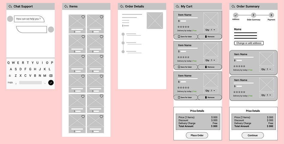
All Mockups
.png)
.png)
.png)
.png)
.png)
.png)
.png)
.png)
.png)
.png)
.png)
.png)
.png)
.png)
.png)
.png)
.png)
.png)
.png)
.png)
.png)
.png)
.png)
.png)
.png)
Accessibility Considerations
Provided access to users who are vision impaired through adding alternative text to images for screen readers.
1
Used icons to help make navigation easier.
2
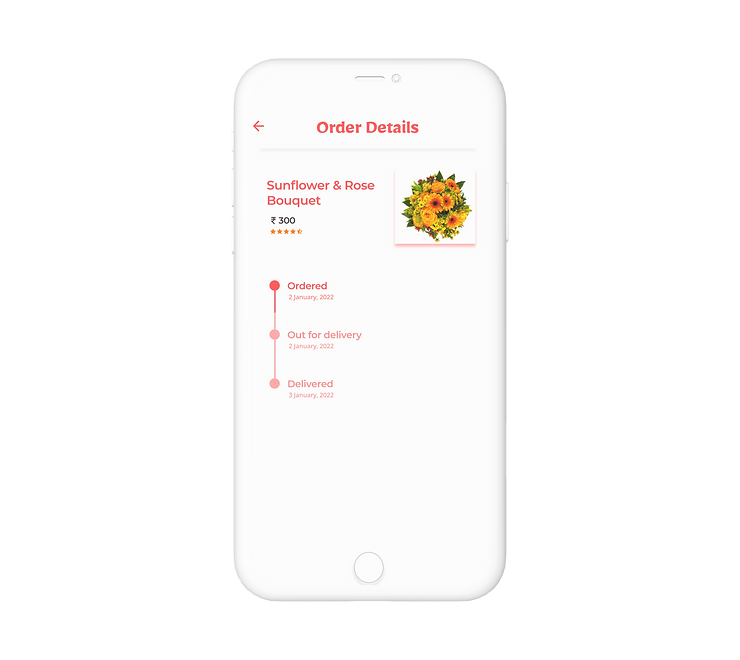
Used detailed imagery of flowers and bouquets to help all users better understand the design.
3
Takeways
The app helps users to find florist and order flowers for any occasion as per users choice.
One quote from peer feedback :
“Hey this work is great, I enjoyed the ride going through your app !”
Impacts
While designing the Blossom app, I learned that the things I had decided initially are not enough. Usability studies and peer feedback influenced each iteration of the app’s design.
What I Learned

Sticker Sheet
bottom of page